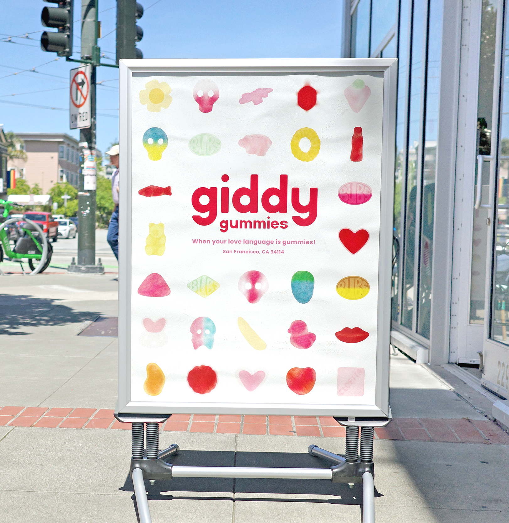
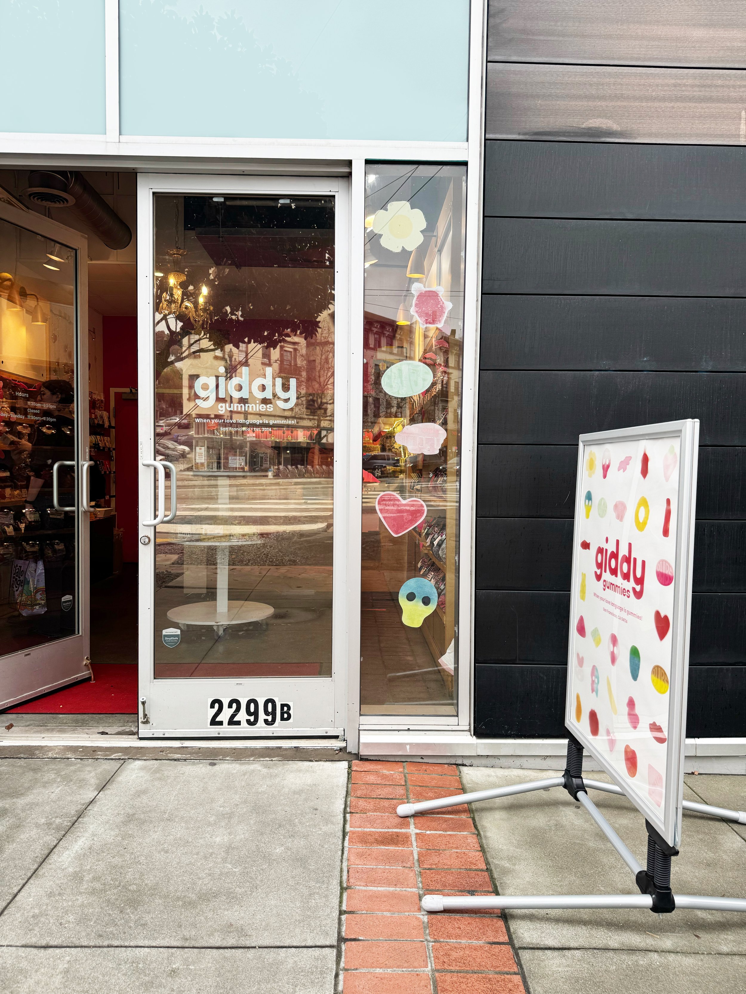
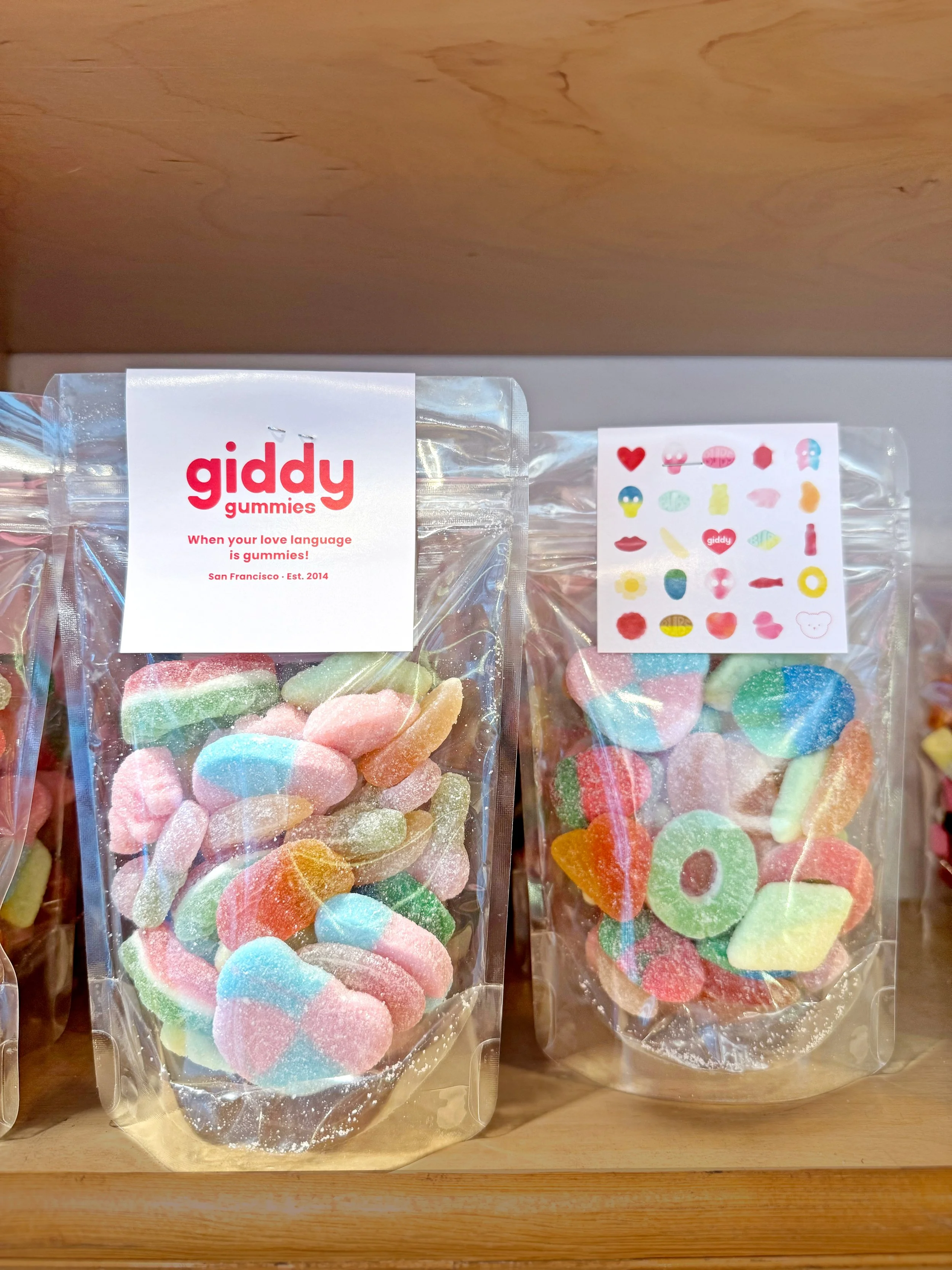
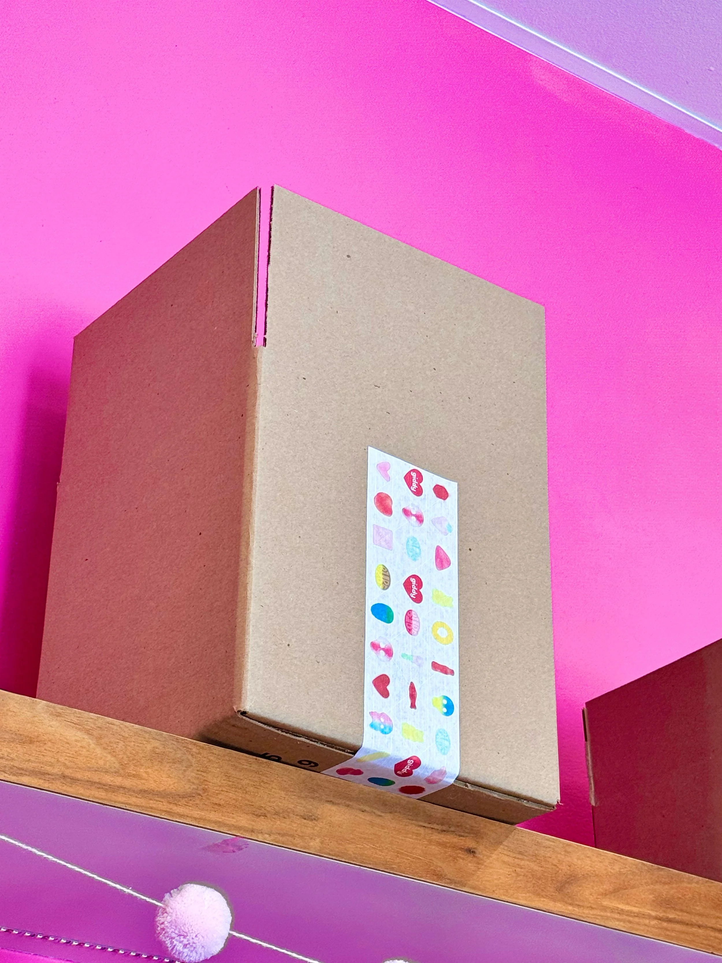
Giddy Gummies
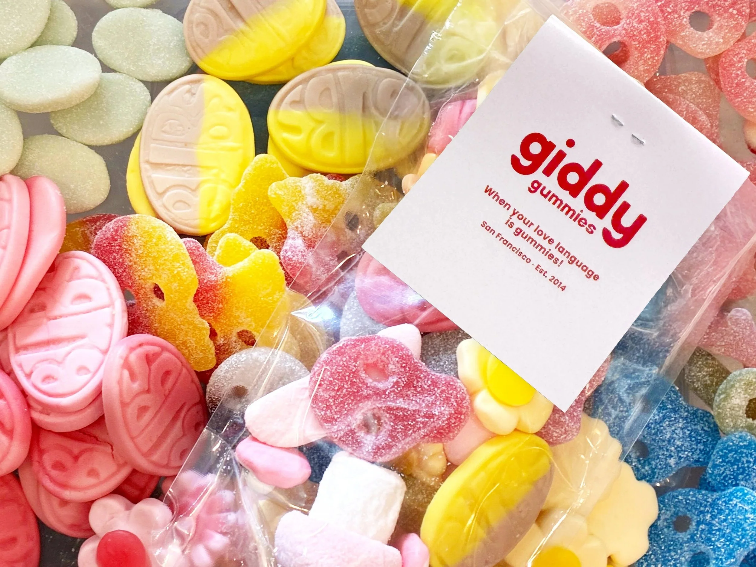
I developed a refreshed brand system, website, and suite of social templates for Giddy Gummies, drawing inspiration directly from the sweets featured in their shop. The goal was to amplify the brand’s core promise: capturing the joyful, almost giddy feeling of treating yourself—or someone you care about—to something sweet.
The result is a vibrant, expressive brand experience that feels fun, heartfelt, and unmistakably “Giddy.”
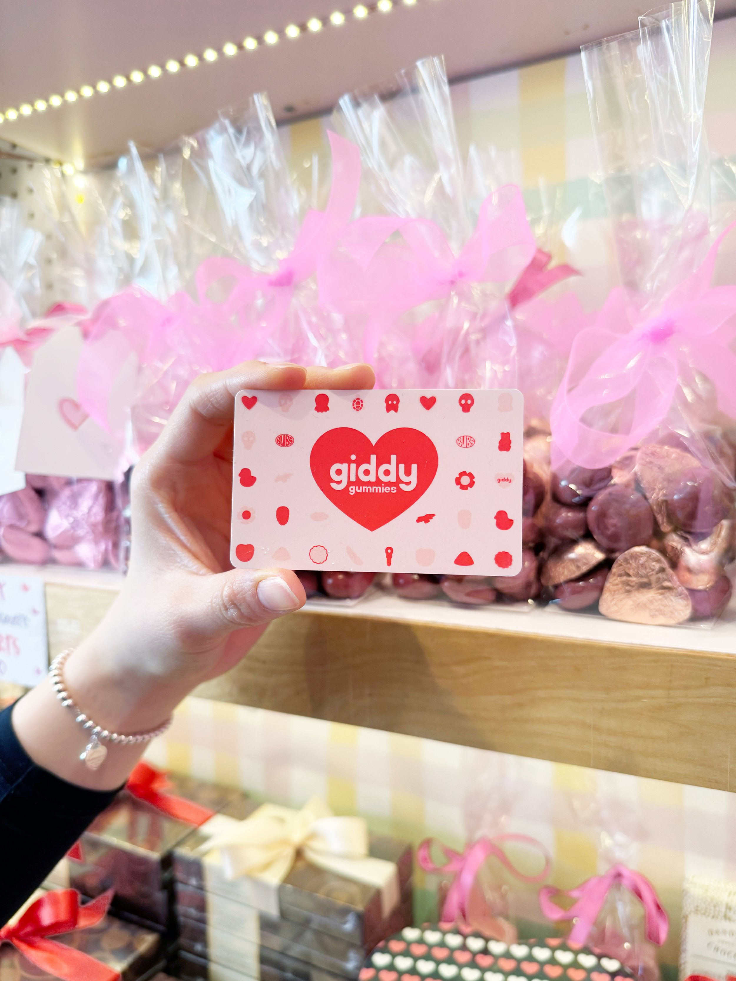
LOGO
The Giddy Gummies logo is built from the soft, rounded shapes found throughout the shop’s signature sweets. Inspired especially by the heart-shaped gummies, the mark blends playfulness with a sense of warmth and affection.
The heart icon became the foundation of the visual identity, inspired by the heart-shaped gummies that are signature to the store’s offerings. The broader design language pulls from playful Valentine’s Day themes, reflecting the excitement, affection, and nostalgia that come with giving or receiving treats on a special day.
BEFORE & AFTER
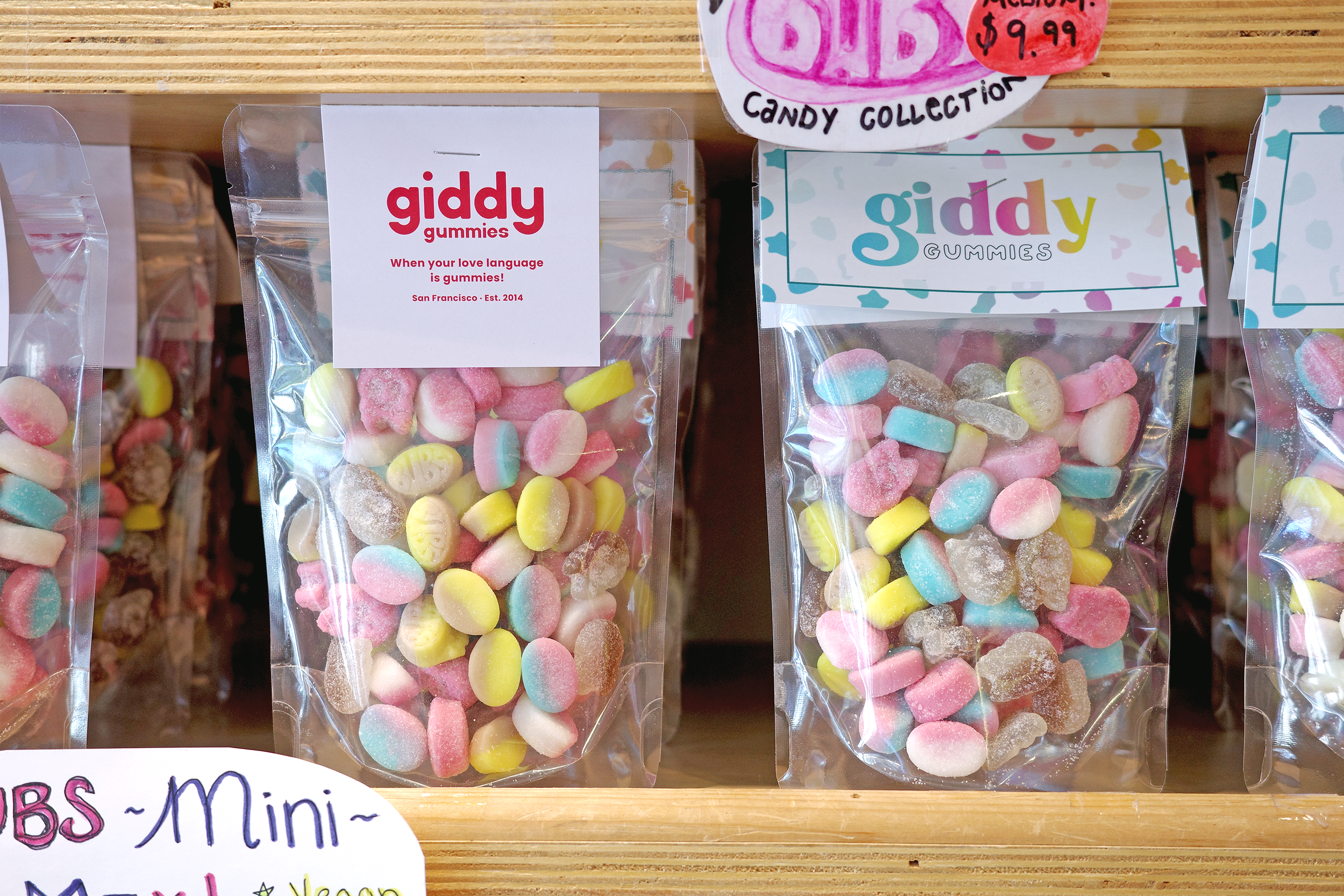
Right Side (After) Left Side (Before)
SIGNAGE