Political Campaign
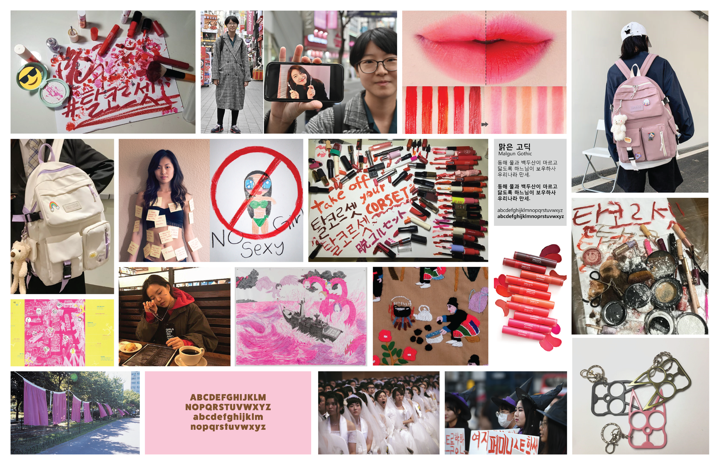
I created a brand identity, poster, and expanded project in support of women’s rights in South Korea. From research, I found that a majority of anti-feminists are 20–30-year-old males who grew up in a gender-biased community. Within school environments, children are encouraged by their teachers and parents to treat the male demographic with respect and boys take advantage of the special treatment to grow more dominant. To approach the situation in a modern-day context, I chose to direct my attention toward younger females and empower them at an early age to take a stand.
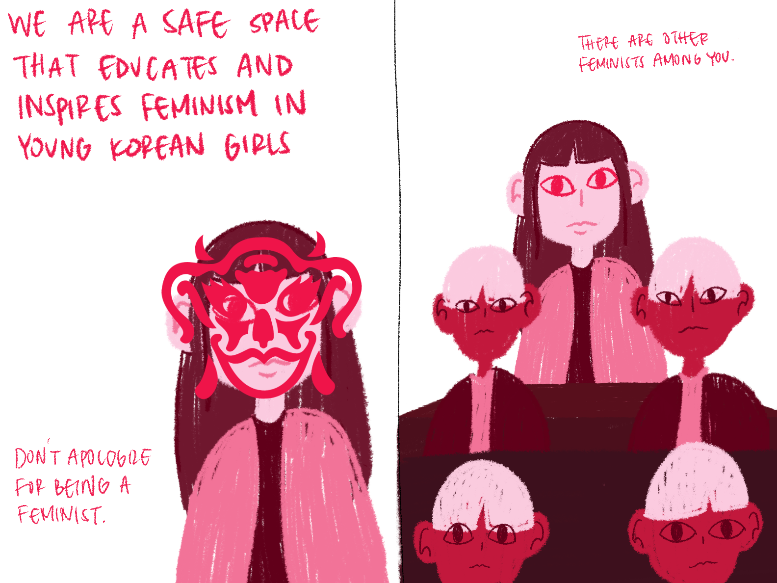
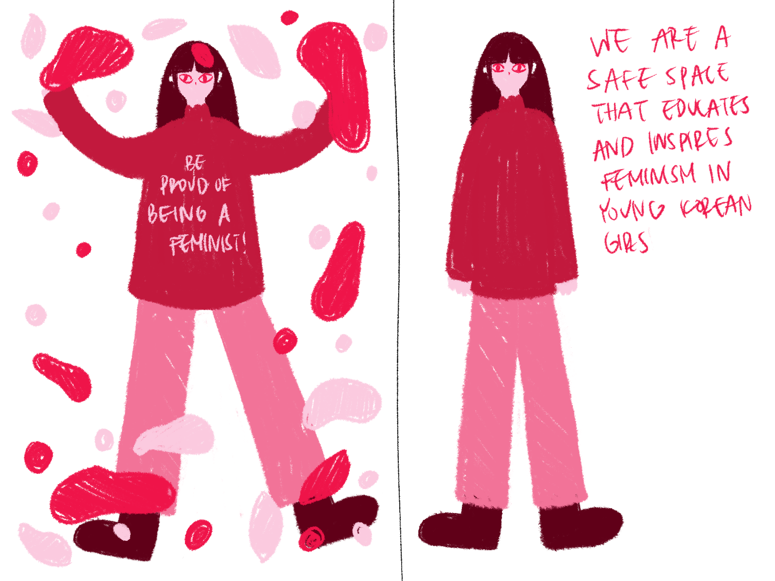
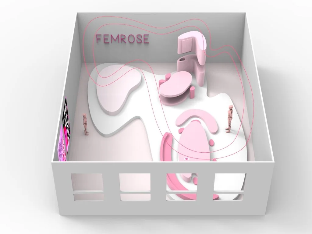
Through my campaign, I hope to inspire and educate feminism among young Korean girls; therefore, I looked into the concept of expression and coming out from hiding. The name “FemRose” comes from an exercise where I combined random words. Roses are delicate and beautiful on the outside but covered in hidden sharp thorns. I attached “Fem” (short for feminists) to make FemRose.

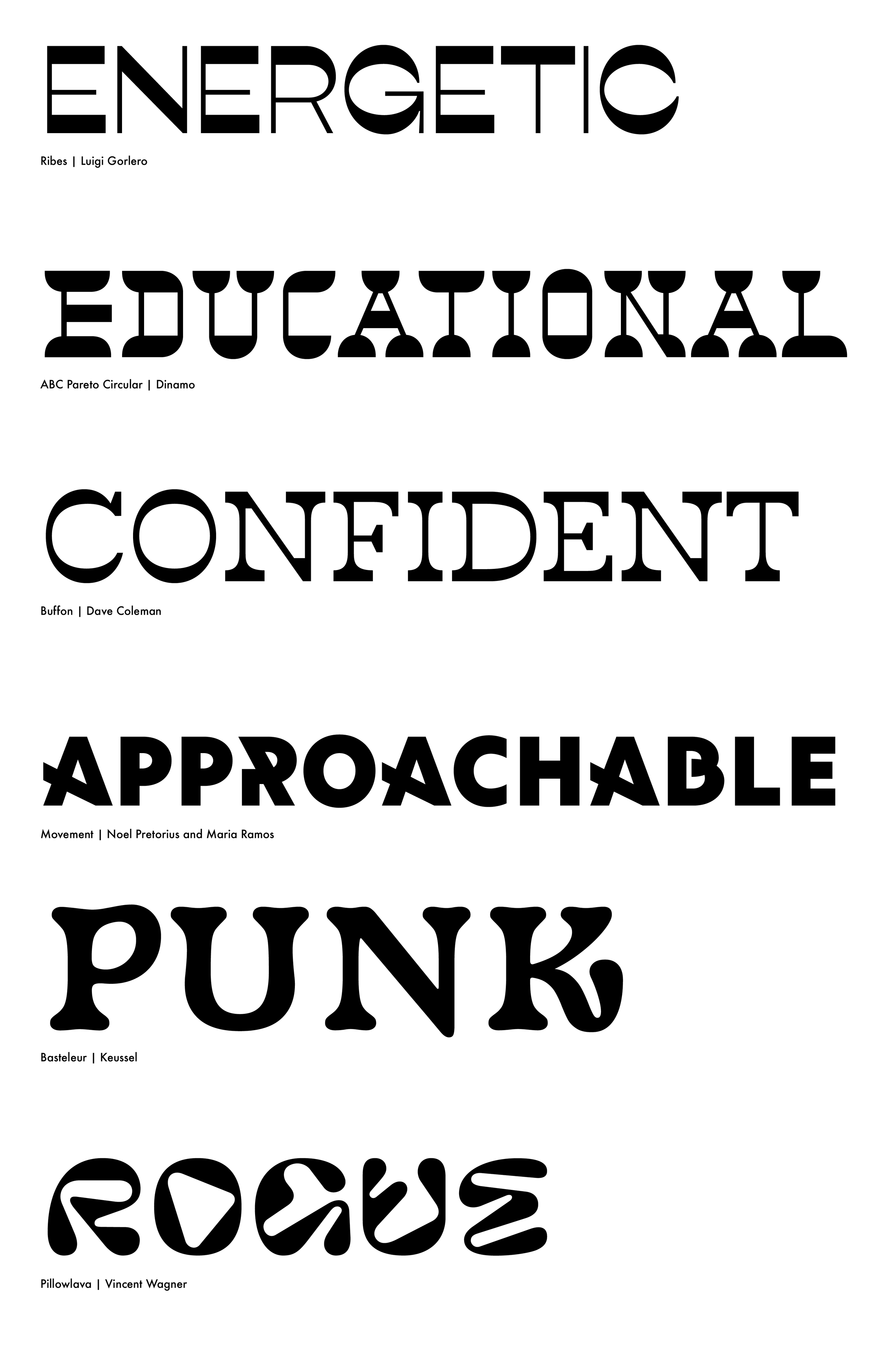
LOGO, COLOR, & TYPEFACE
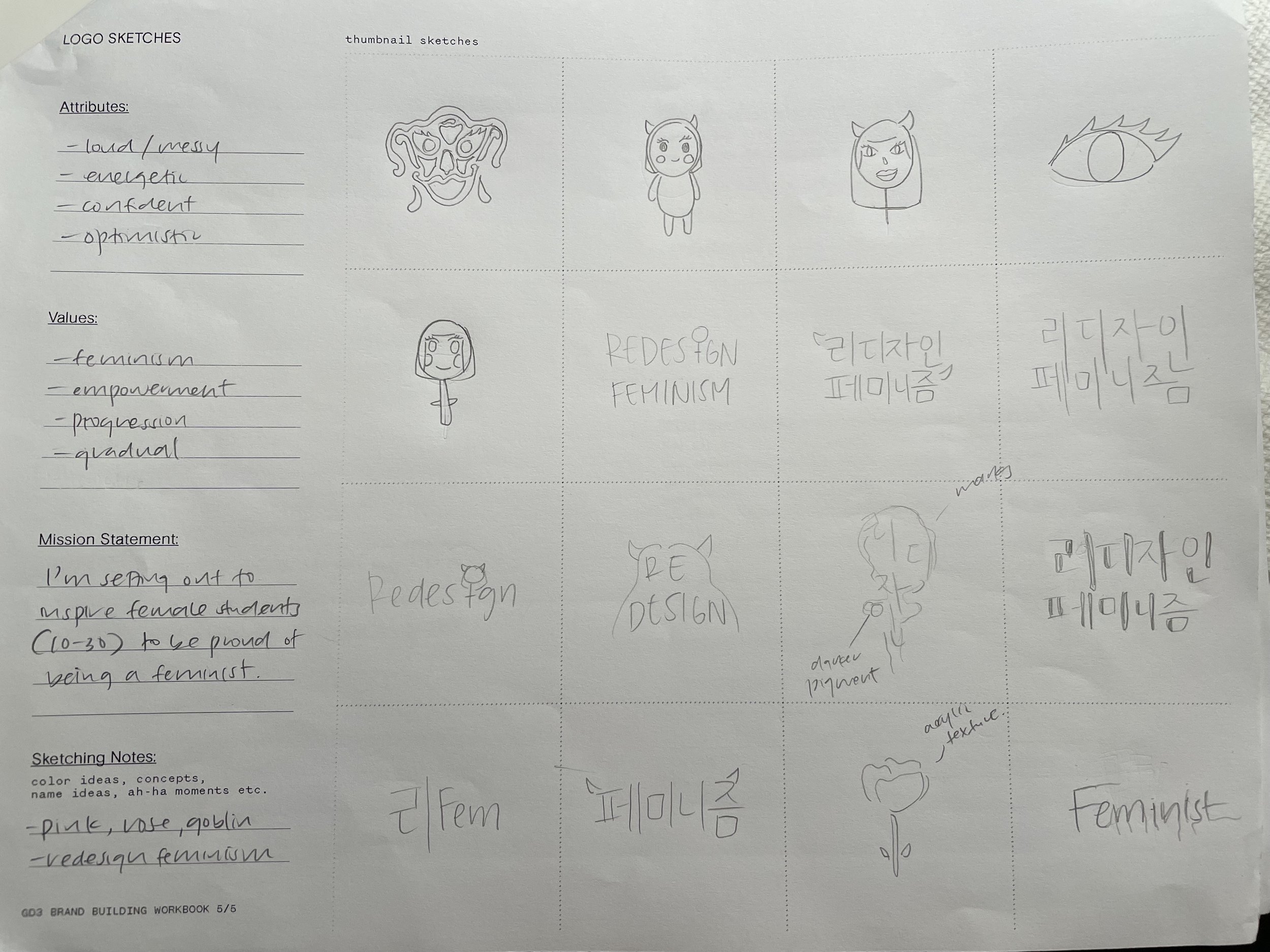
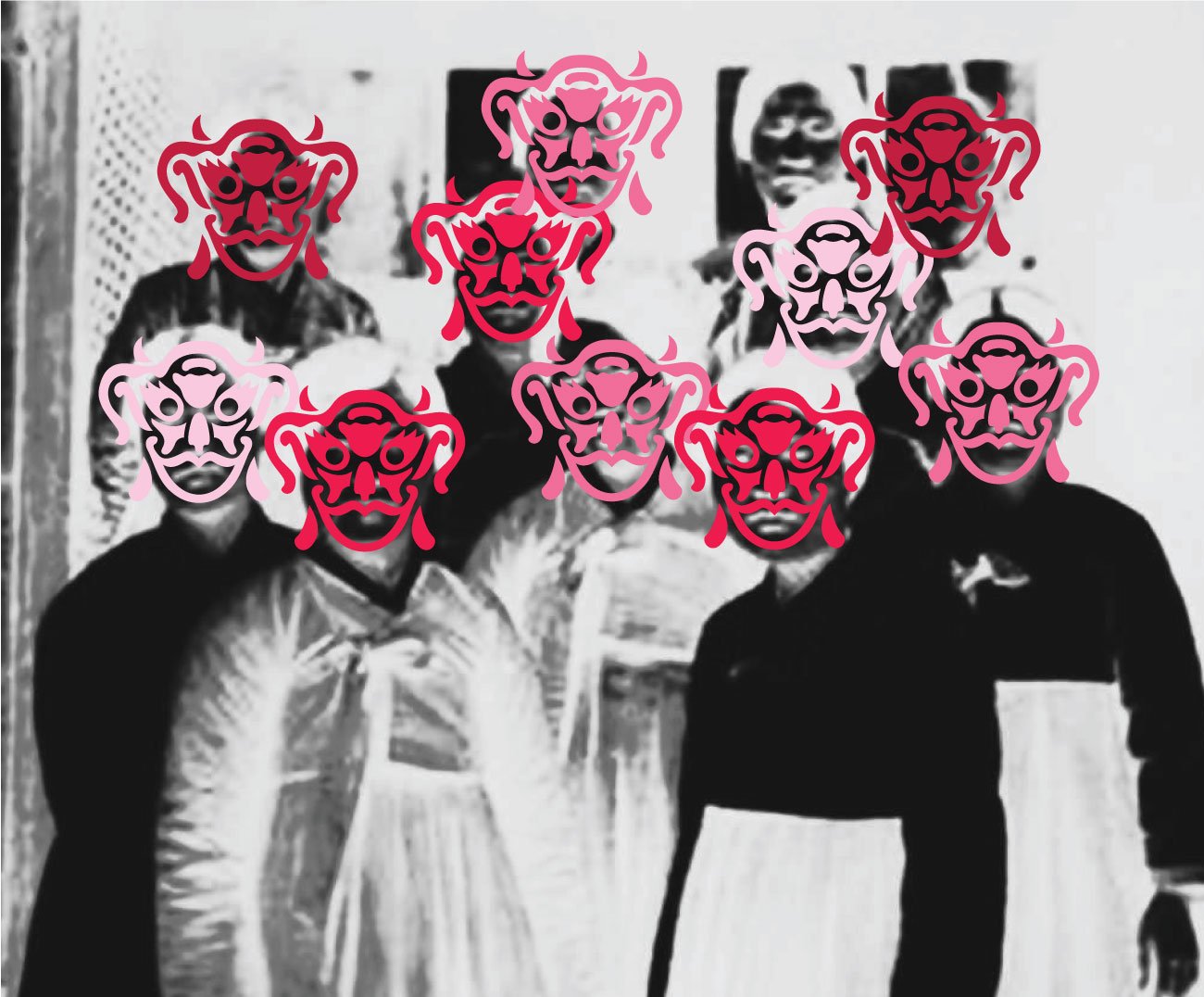
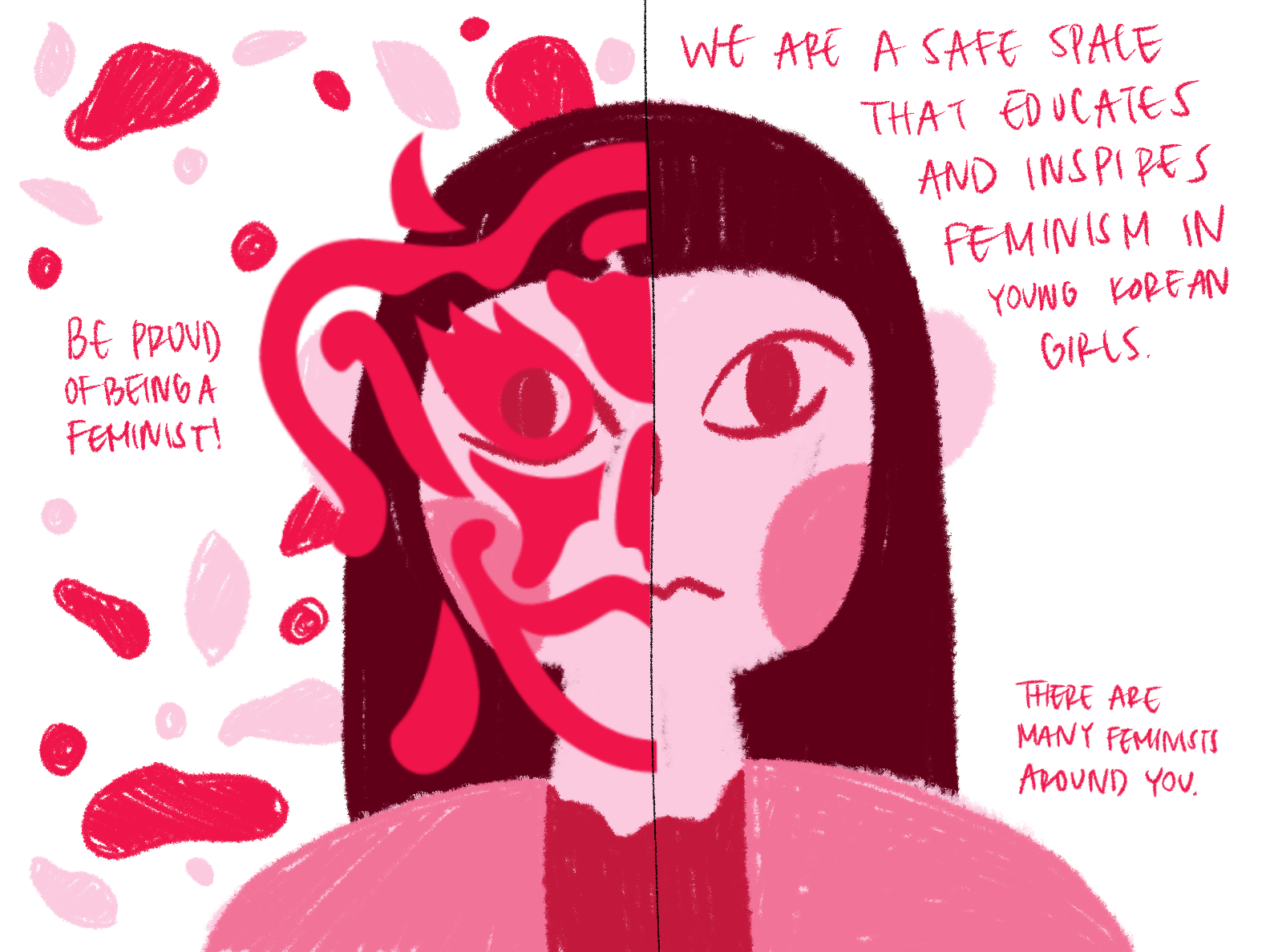
I drew a combination of illustrations, symbols, and type for 45 minutes to get ideas out. I was inspired by traditional goblins (typically male), roses, molka, etc., which are all words related to the topic, found during the research process. Ultimately, I went with the mask logo as it was a female traditional goblin mask that would represent how feminists should take pride in the saying “all feminists are goblins”. In addition, it relates to how young feminists are hiding behind a mask.
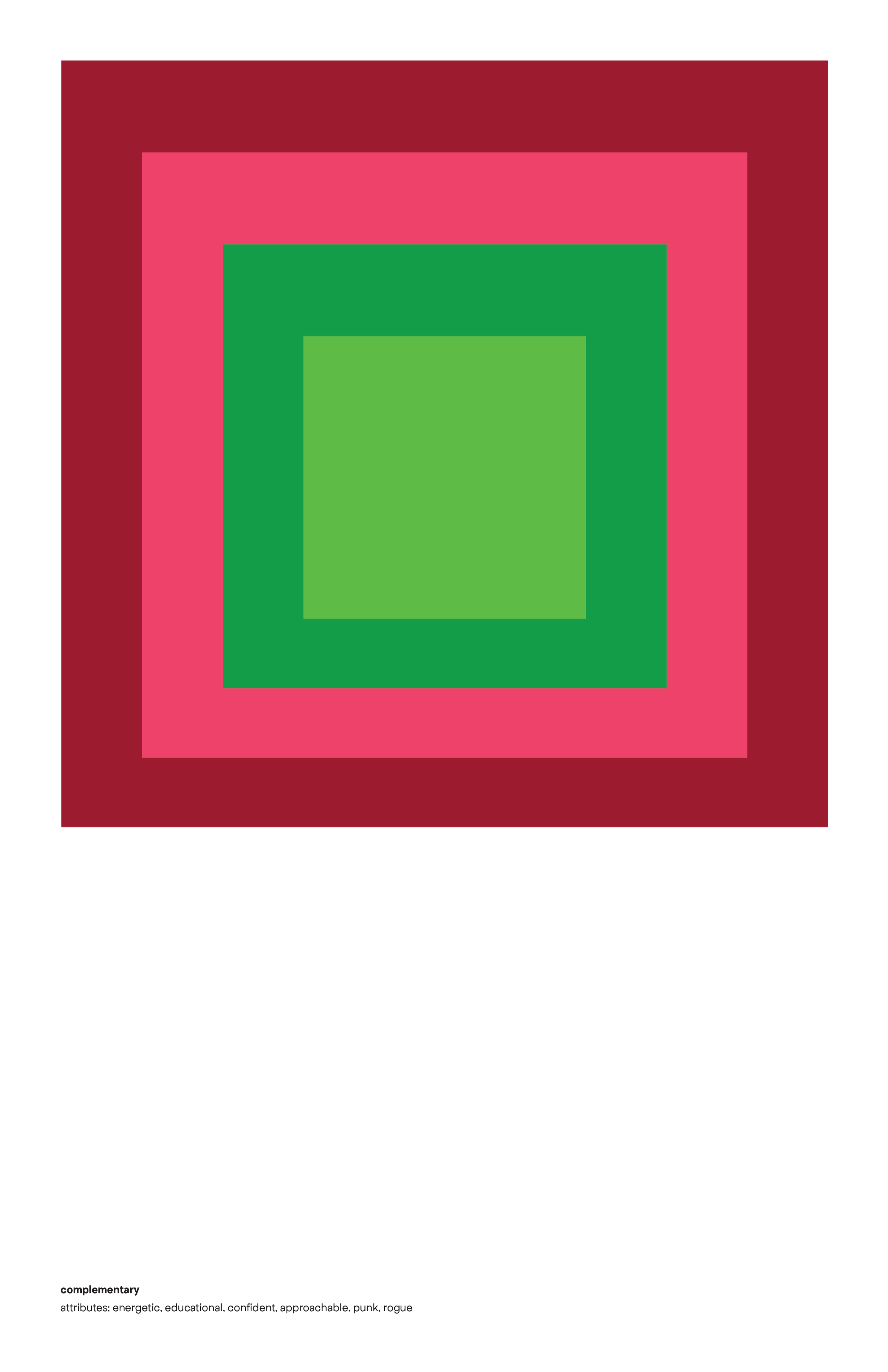
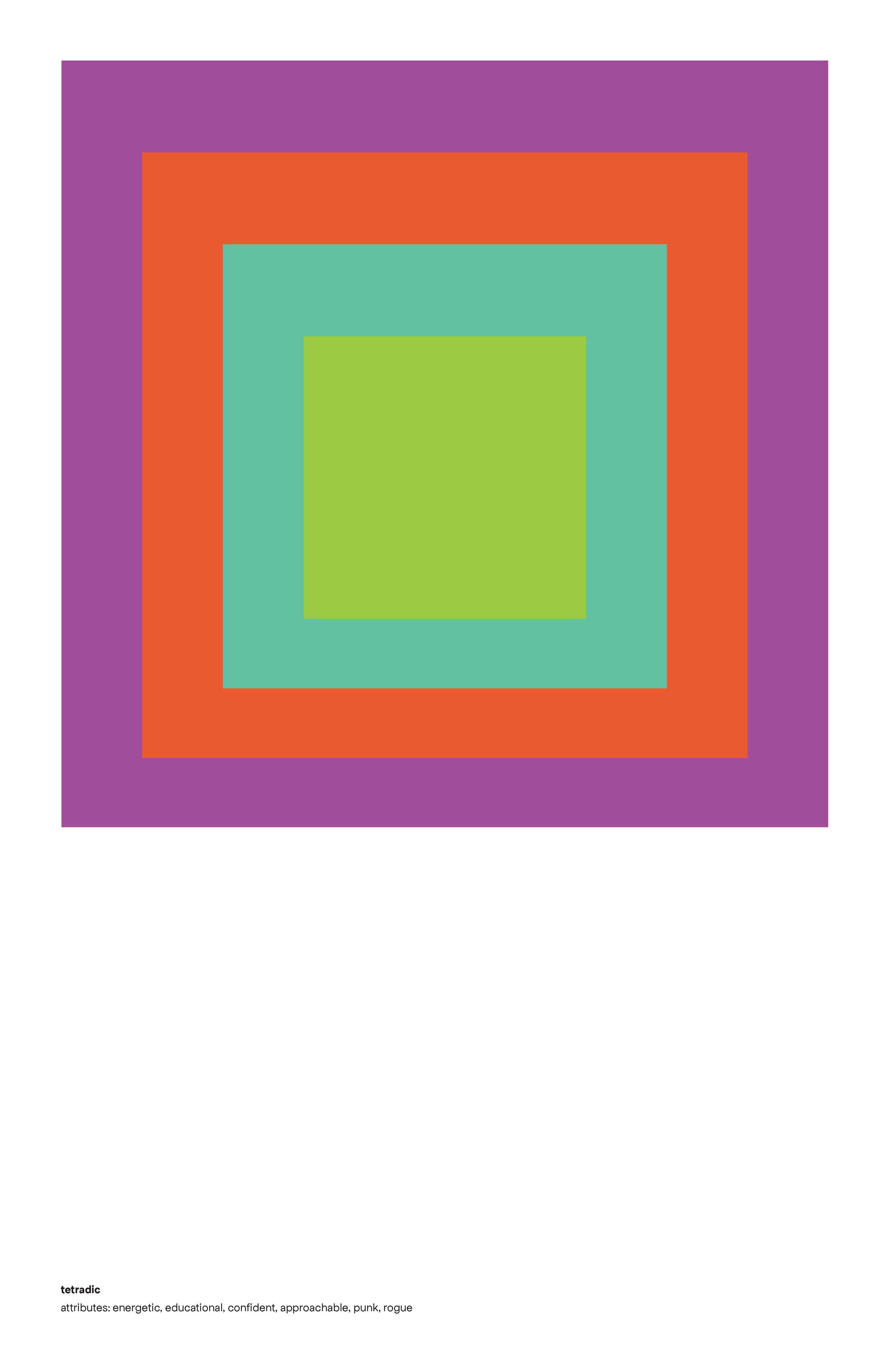
The color palette is based on popular lip tint colors sold in Korea. I landed on using a monochromatic palette because it proved to be the most eye-catching.


IMAGERY
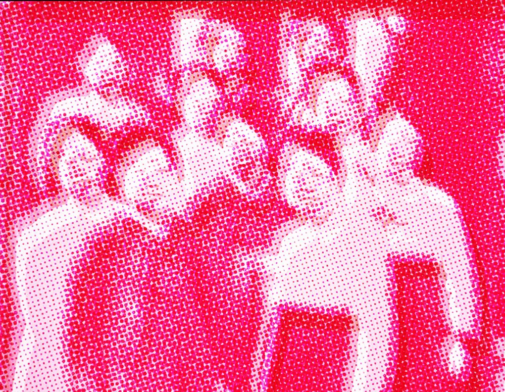
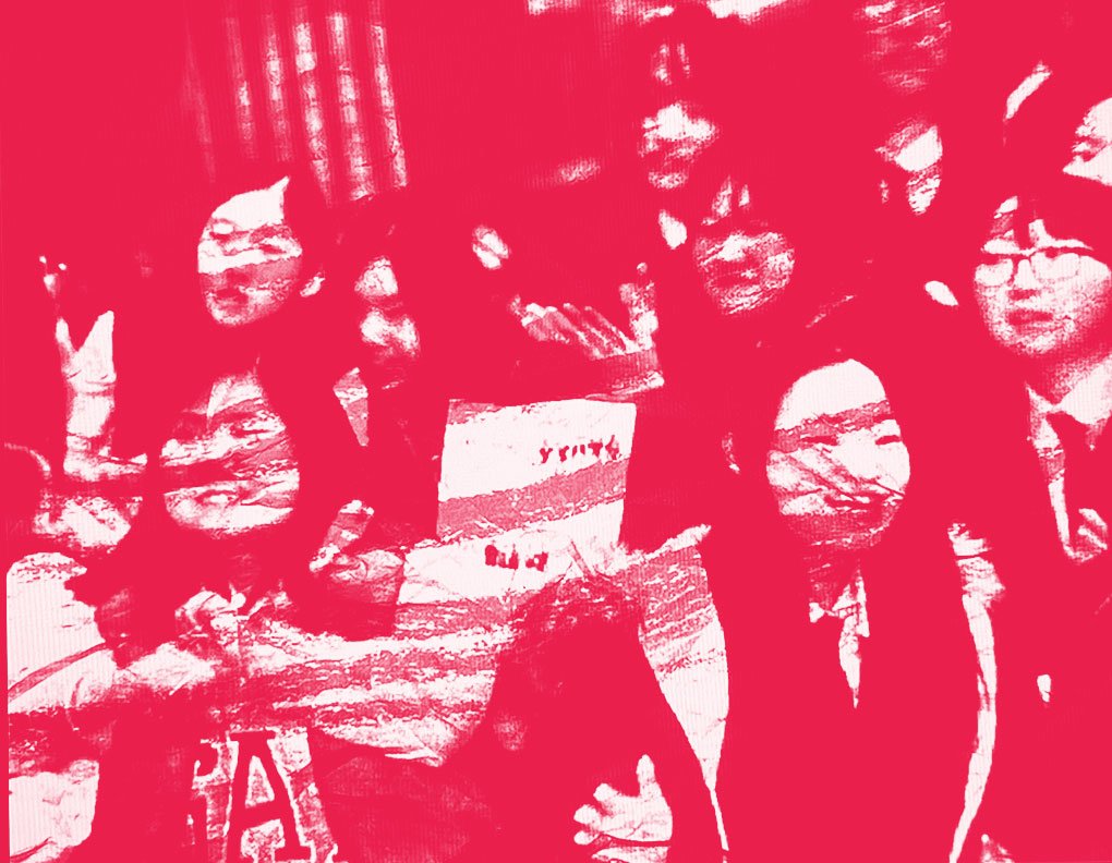
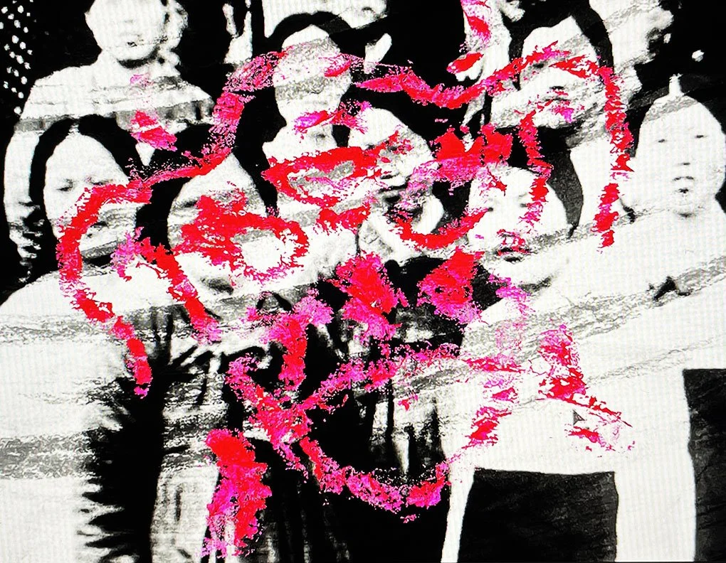
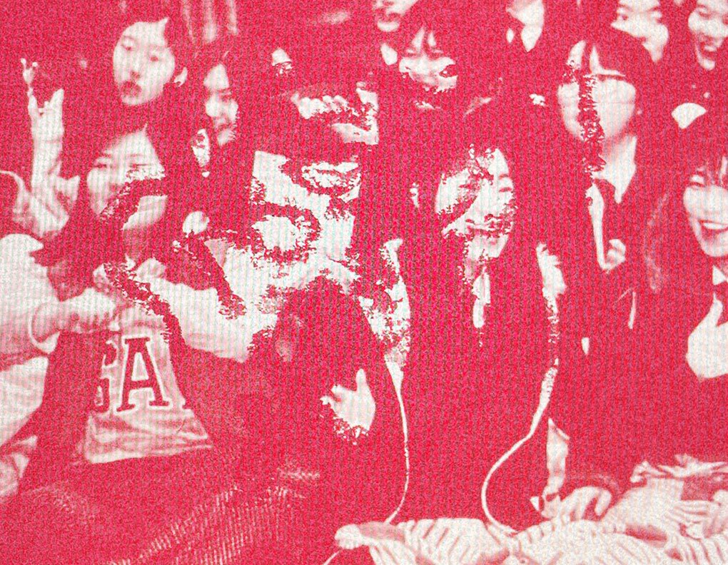
For imagery, I drew the logo with lipstick to get a rough texture, used poster marker, pastel, paint, duotone, halftone, gradient colorize, etc., and laid these over images on photoshop but the outcomes were unrealistic. I then projected images on the wall and put texture over the projection but the overall mood was too violent for a campaign that wants to provide young Korean girls with a safe space.


POSTER
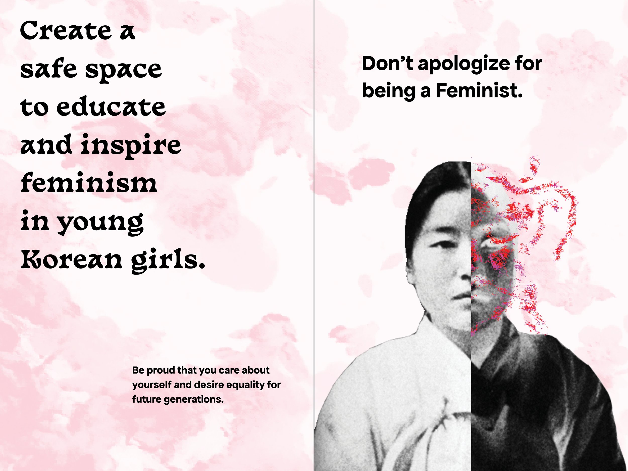
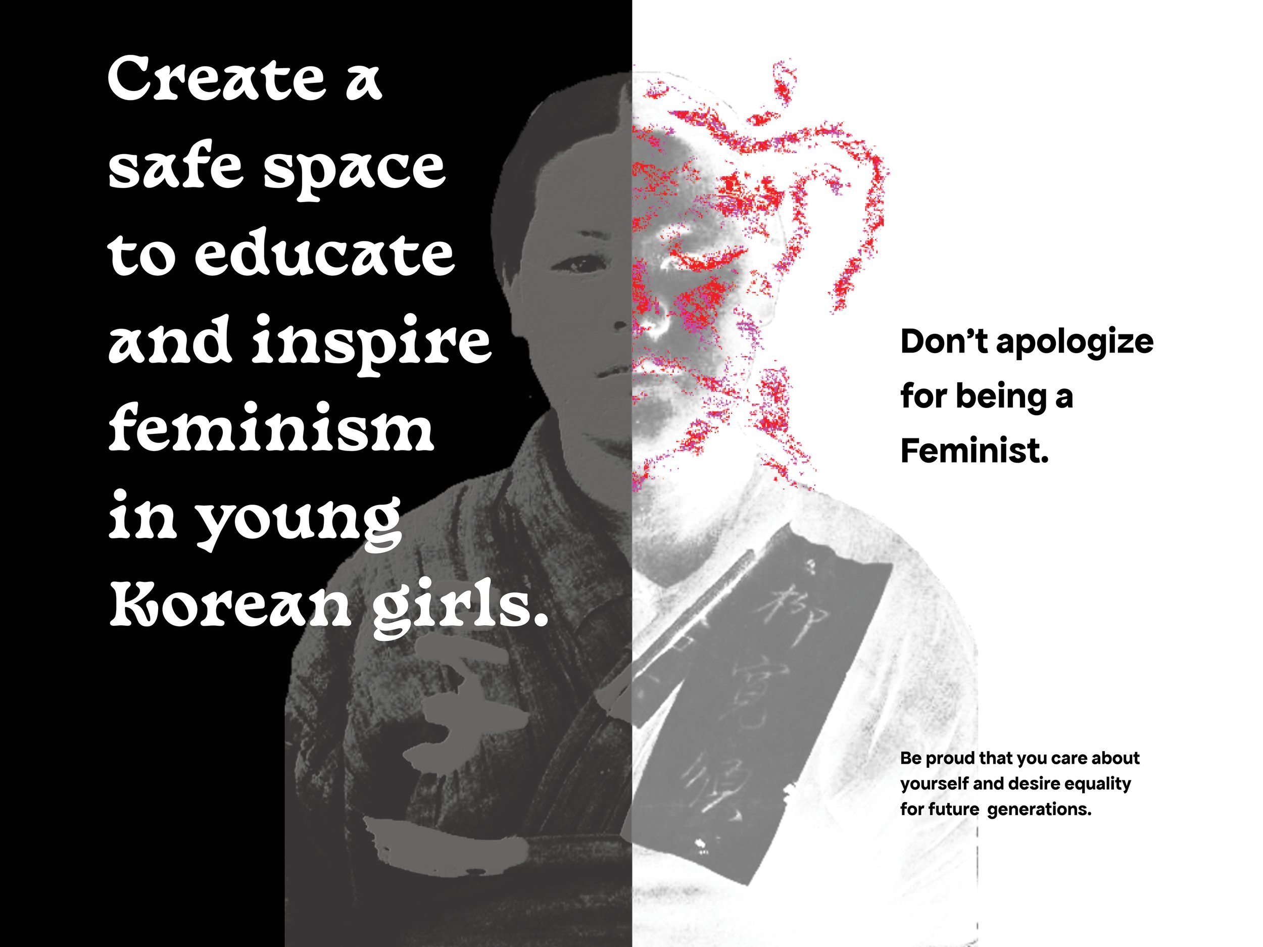
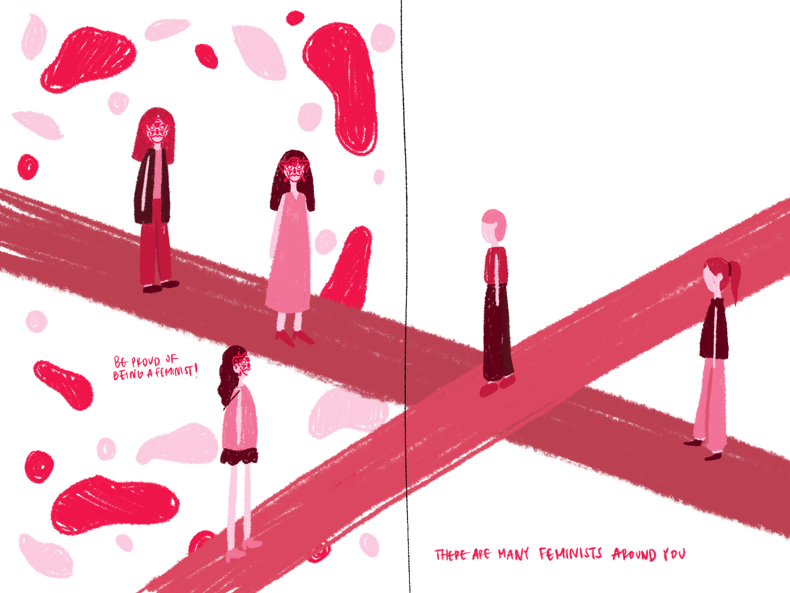
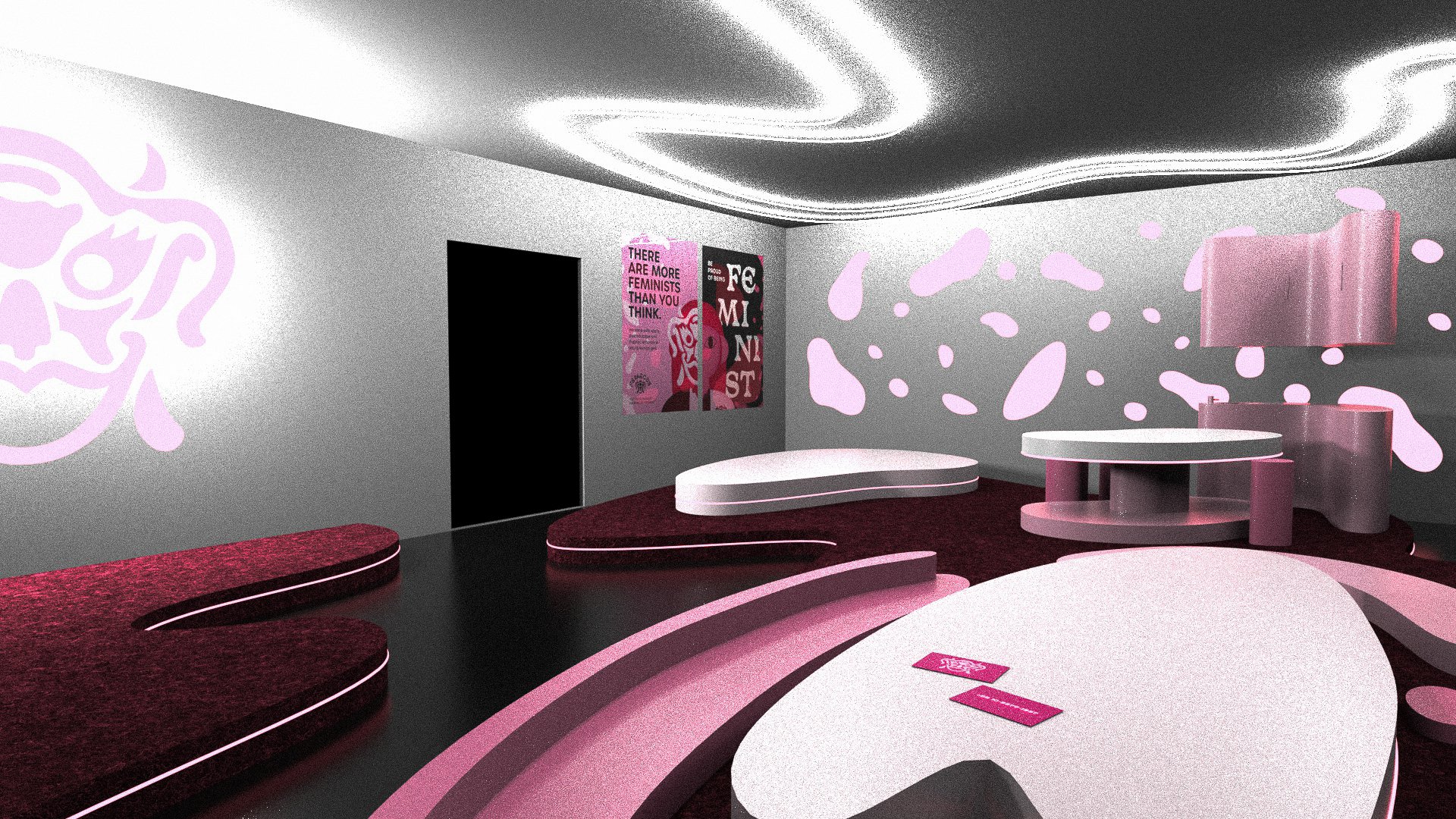
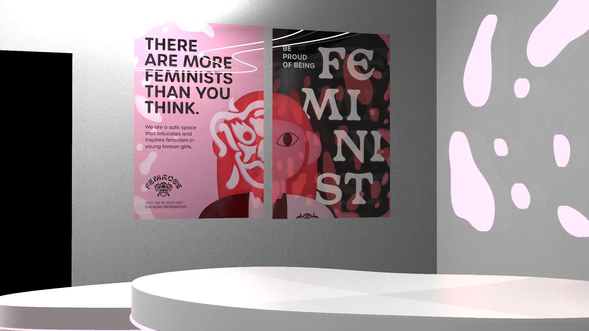
I found that illustration-based designs are the most appealing to young Korean girls so I decided to discard my attempts with texture. I came up with three diptych poster ideas and chose the concept that closely aligned with my mission statement: encourage hiding feminists to join a safe space. On one poster, the girl is wearing a feminist mask and is open to a light environment. On the other poster, the feminist is hiding and feels trapped to conform to societal desires. The girl, however, wears a pin to indicate her desire to come out as a feminist without facing the fear of getting harassed by a male anti-feminist.
I later added texture to the poster because it was too flat and drew inspiration from the artistic styles of Tracy J. Lee and Julia Hasting. Both artists use texture as a way of elevating their flat images to create a sense of depth.


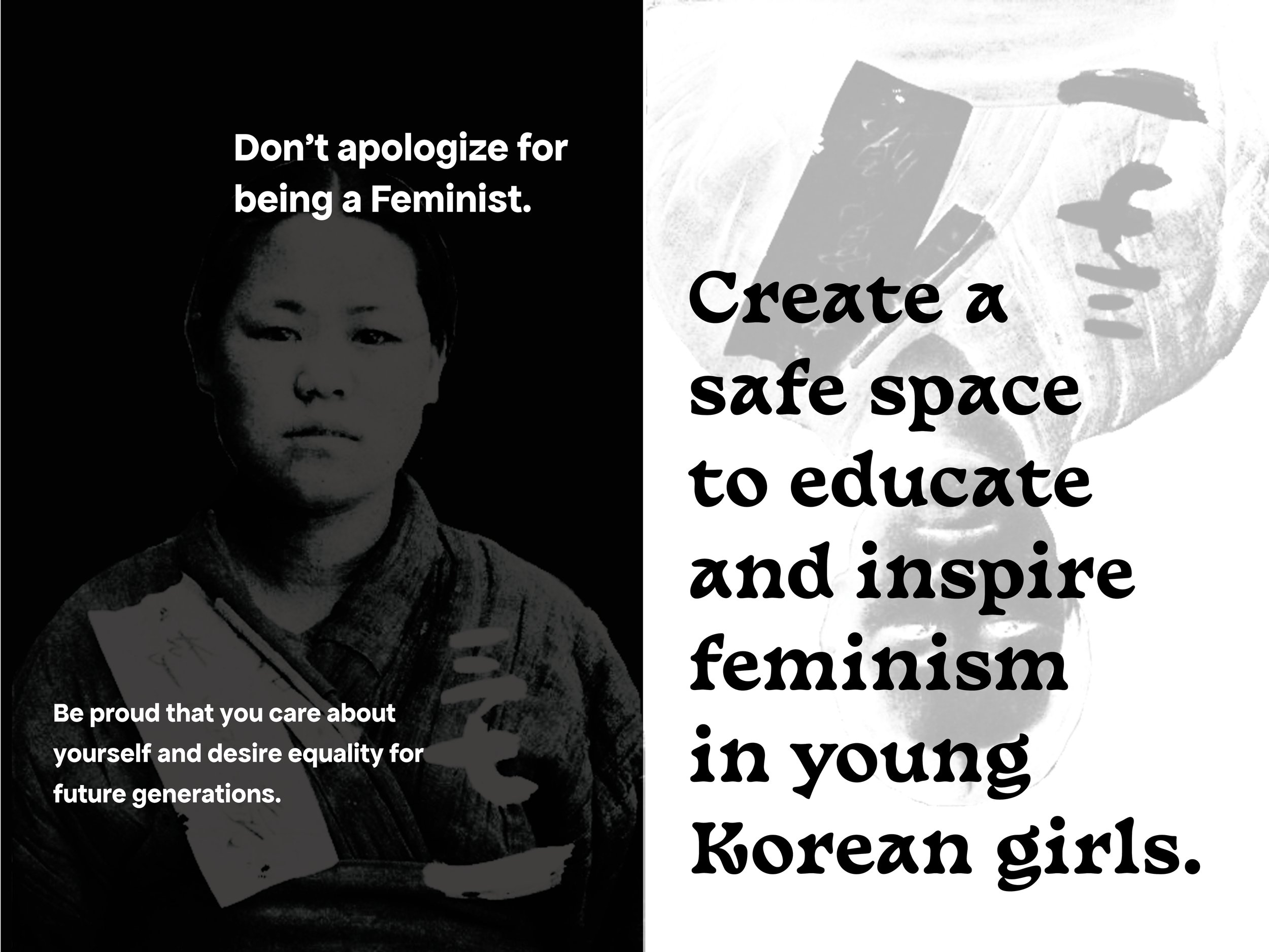
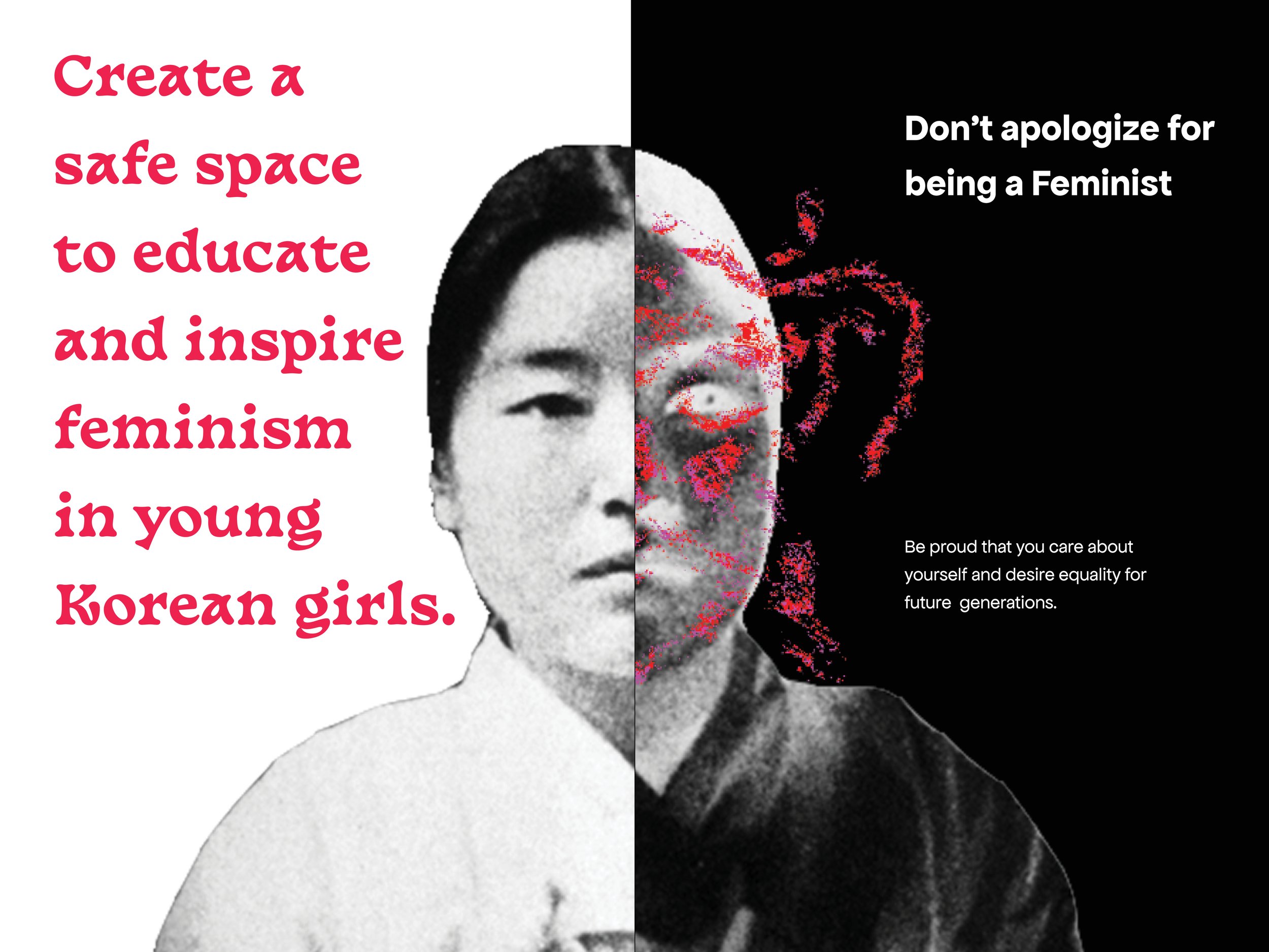

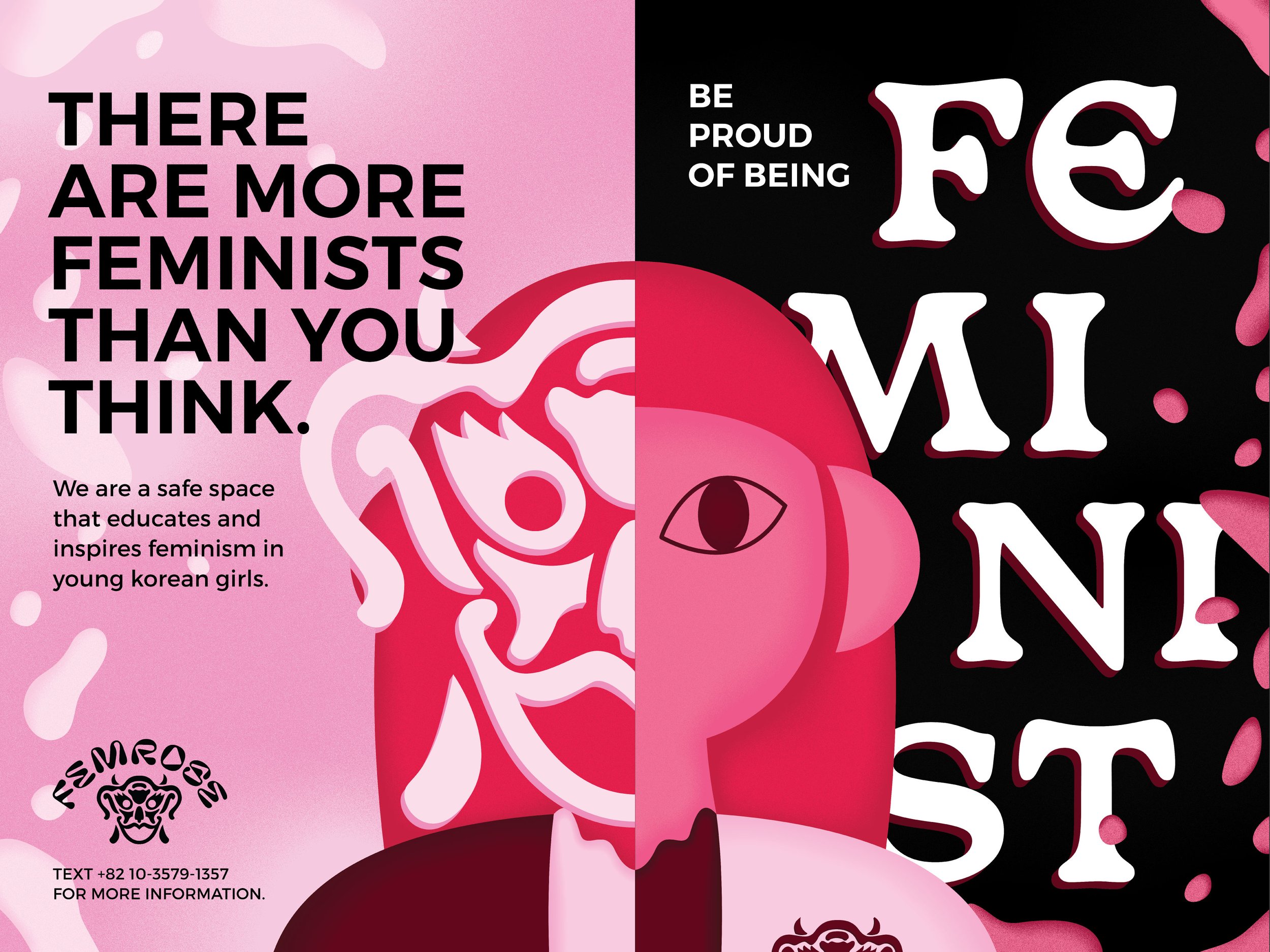
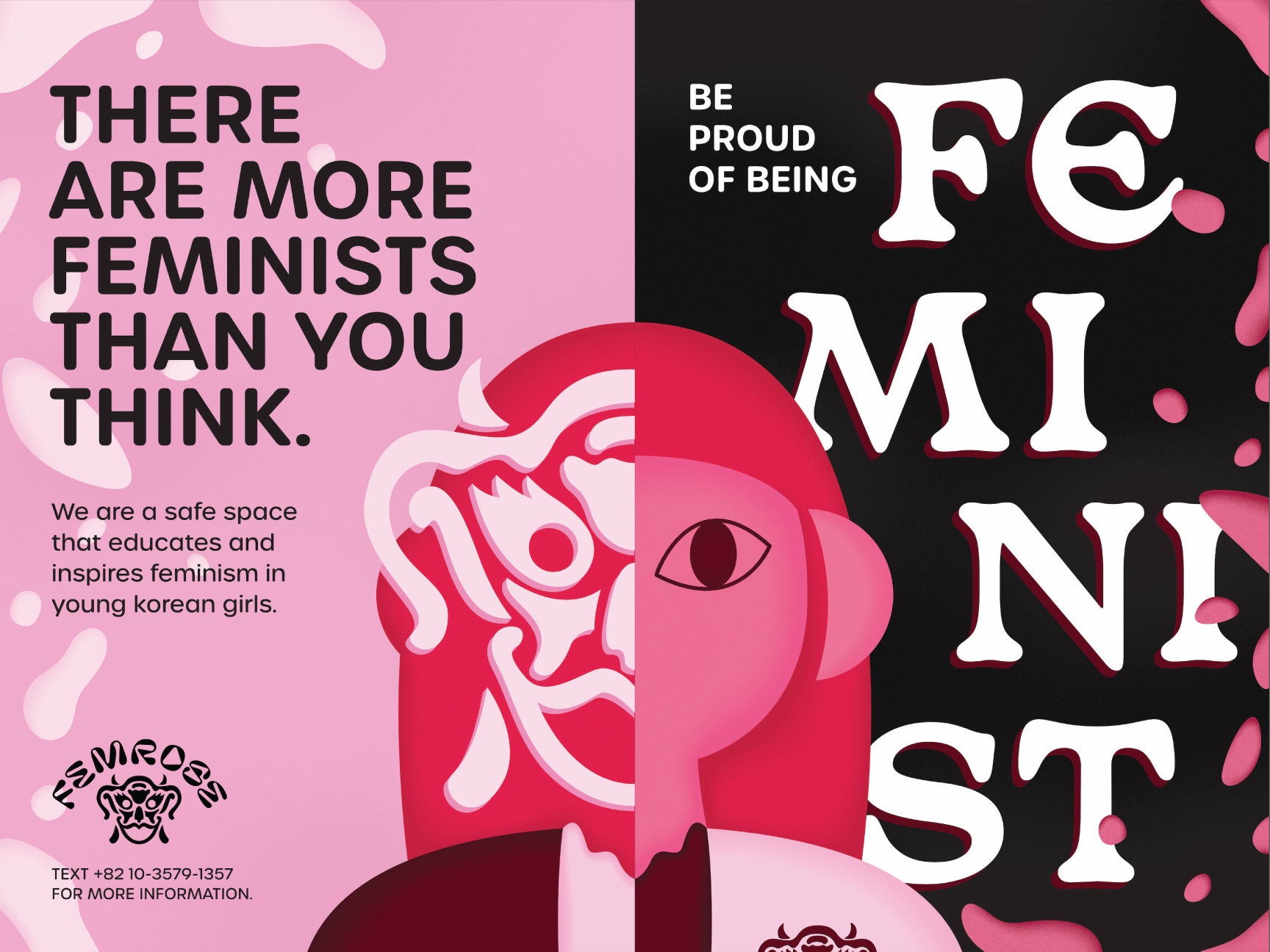
Final posters live side-by-side.

The posters would exist on walls where students walk by on the way to school.
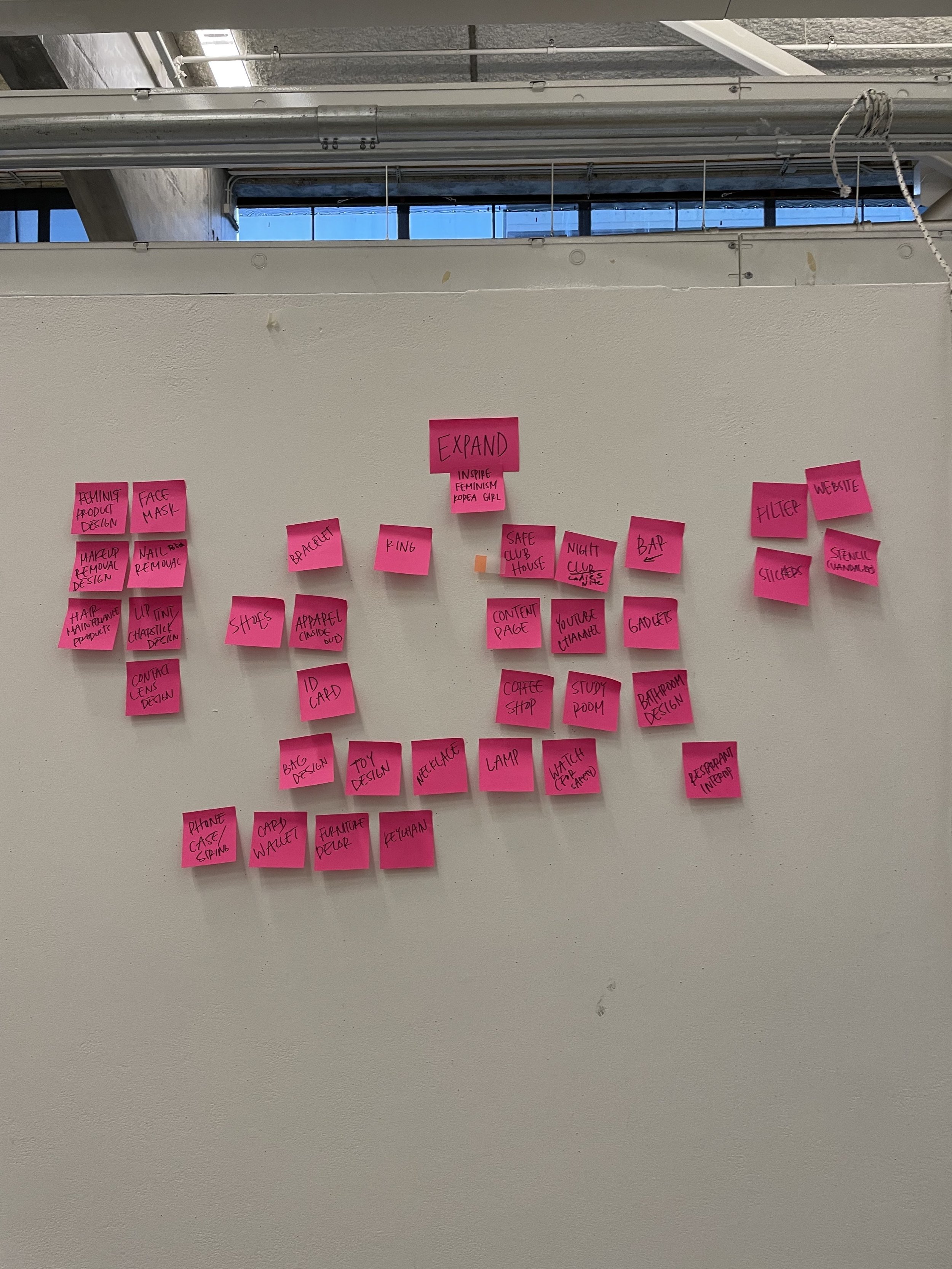
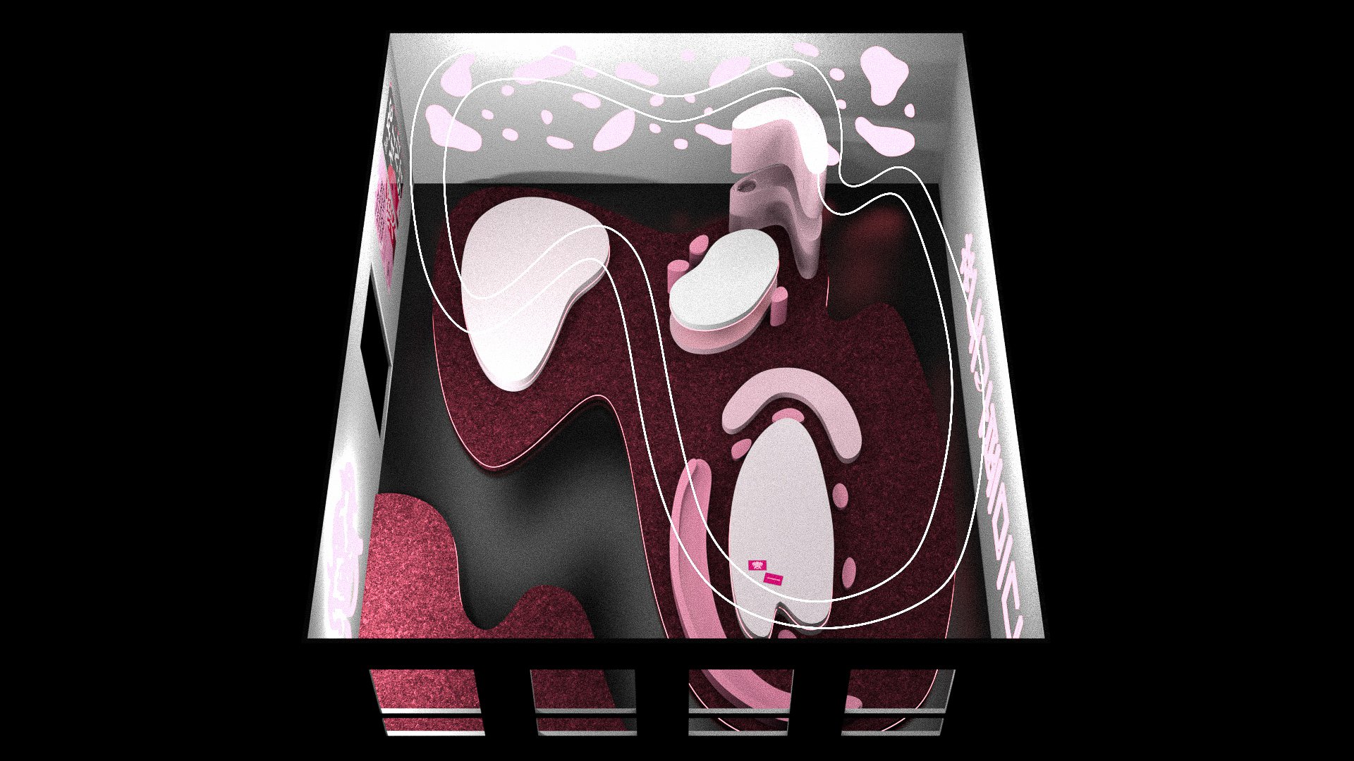
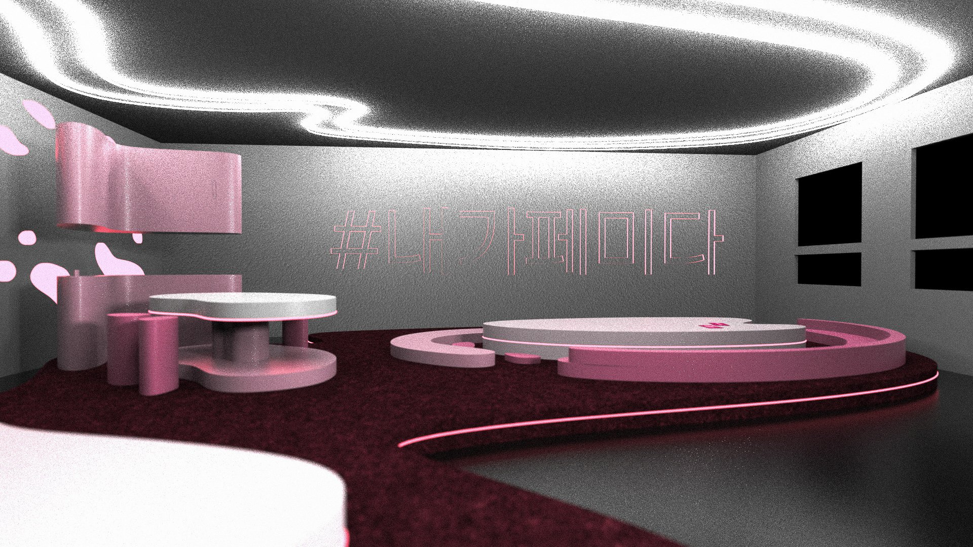
EXPAND
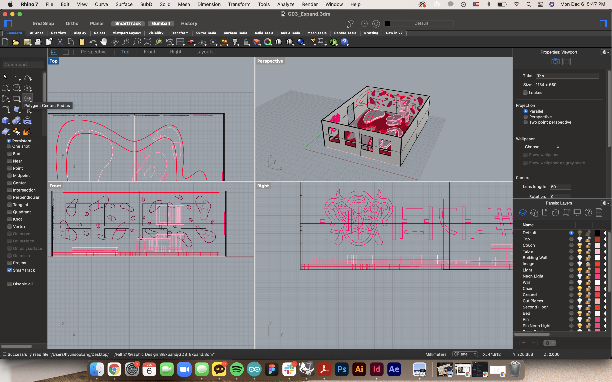
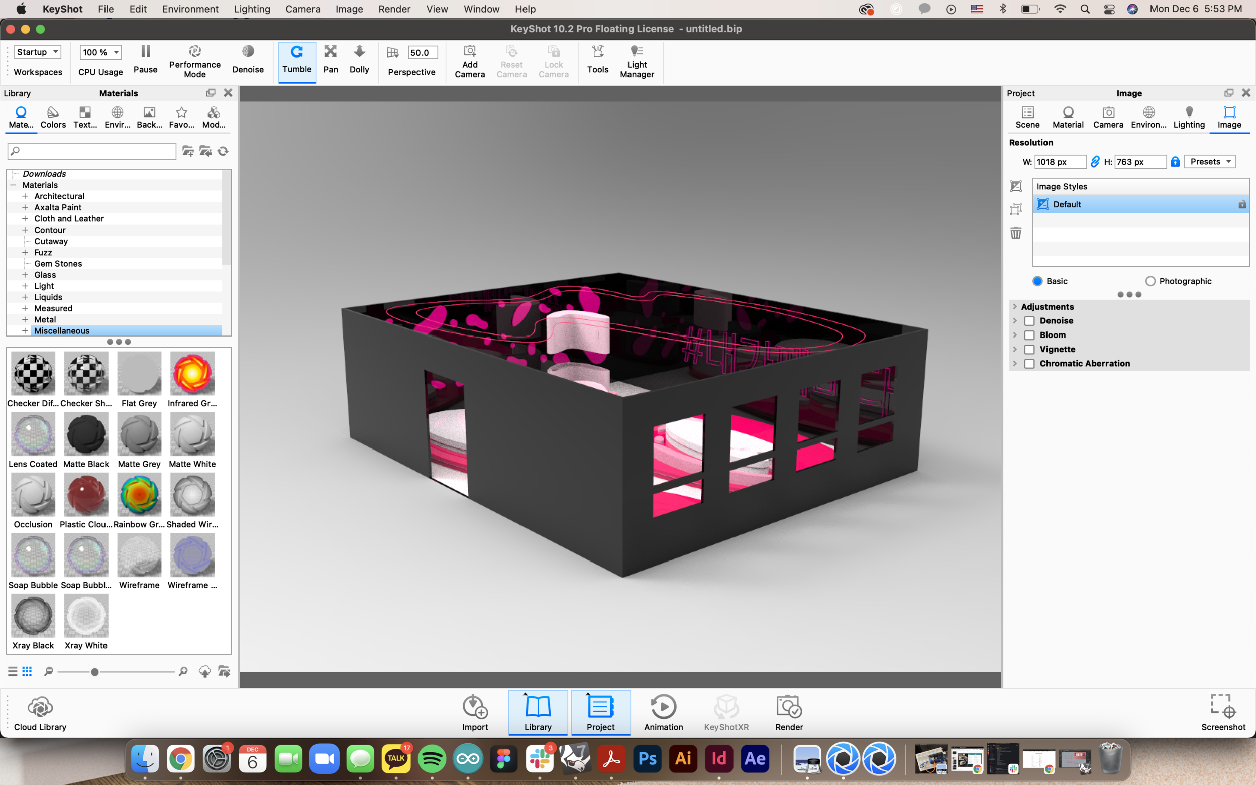
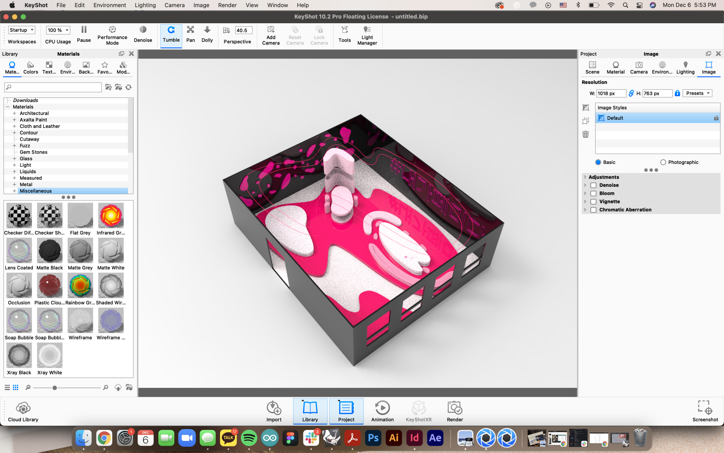
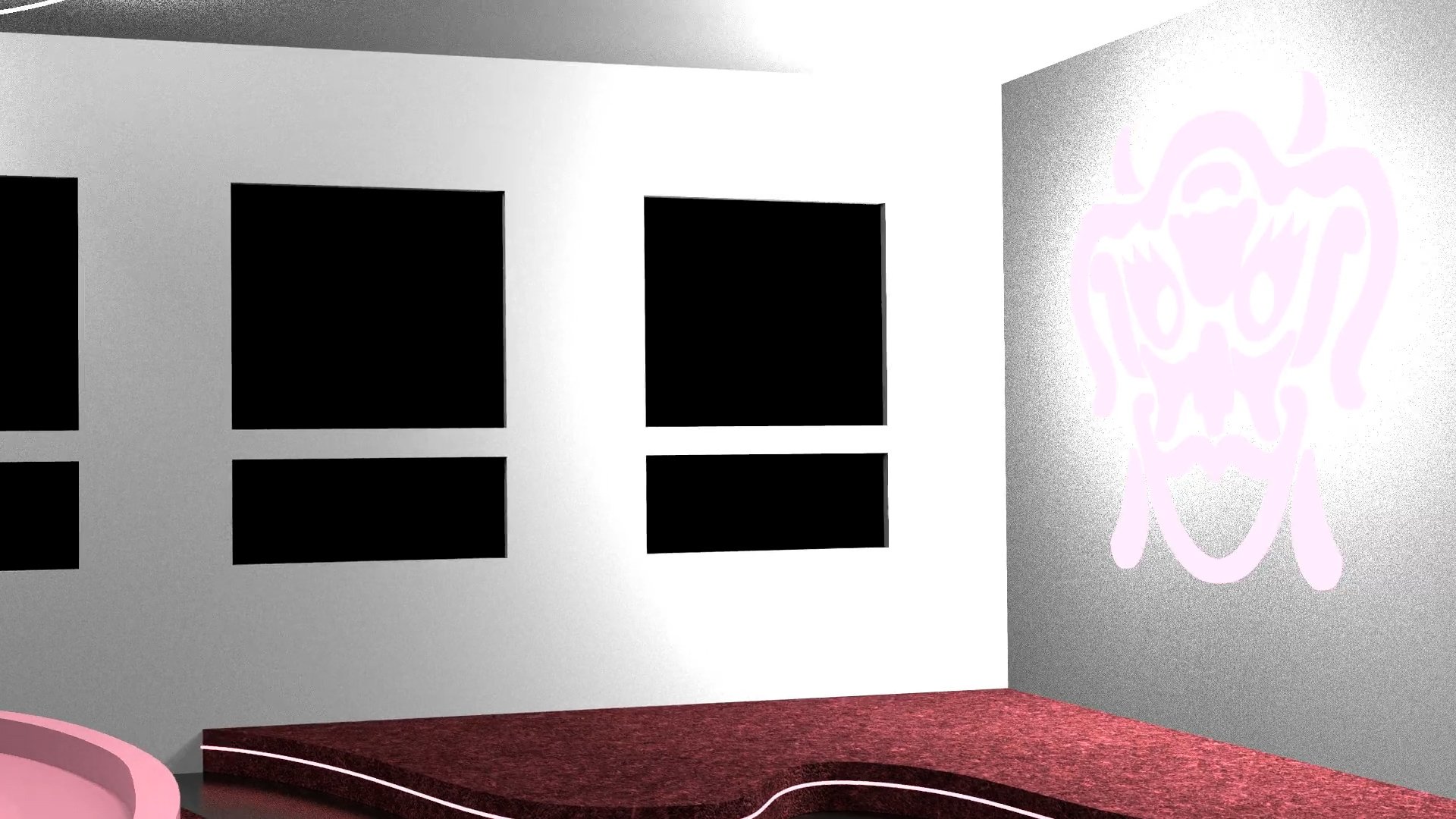
For my expansion project, I created a model of a physical club for female students to utilize.
I wanted to continue the concept of rounded edges within my safe space so I found designs of buildings and furniture that are made up of curved corners. I then sketched ideas on Procreate and started to experiment with Rhino. Since this safe space would be in Korea, I chose a space I could reference. Korea is mostly populated with apartment buildings and small studio spaces, which would prevent a huge space from being created.


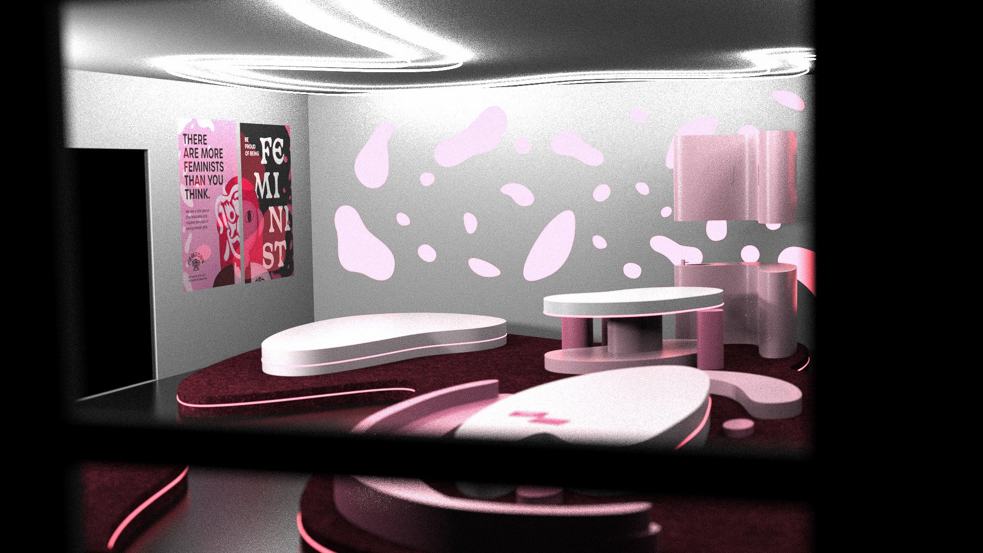


When an act of feminism is shown, they are given a club info. card.
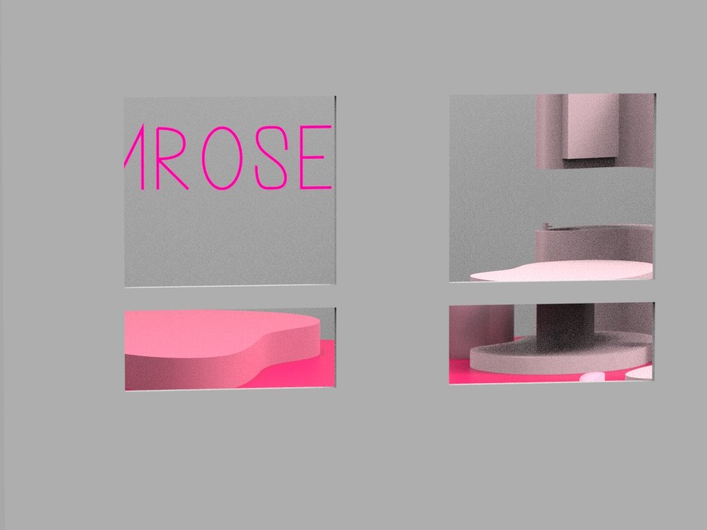
Take a tour inside the club!